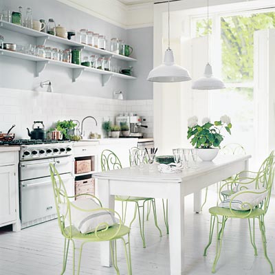
Featured in This Old House magazine, a simple white kitchen suddenly becomes not so simple when introduced a set of lime green bistro chairs. I absolutely love how this pop of color makes this kitchen interesting and lands a perfect touch to otherwise very simple space. A simple white table surrounded by these chairs and the rustic wine crates are my favorite features in this kitchen.
Credits: Jessica Dodell-Feder, This Old House magazine
Photo: Debi Treloar


That picture of the all white kitchen you posted is gorgeous. I've always found that "all white" spaces, when designed purposefully, can feel like a drink of fresh water, particularly in a "space challenged" home. The pop of green in this space in not overwhelming, and is tastefully repeated in little splashes throughout the space. Beautiful!
I was also wondering what you thought about the wood painted floor in this kitchen. Maybe you can do an article about floor choices for kitchens in general.
I am gald you liked ths post. You've noticed the white floor in that kitchen which is a very contravercial topic as far as the kitchen floor goes. I will most definitely address it in one of my future posts. I have some very interesting images pinned to my wall. Do follow me on Tweeter so you won't miss it.